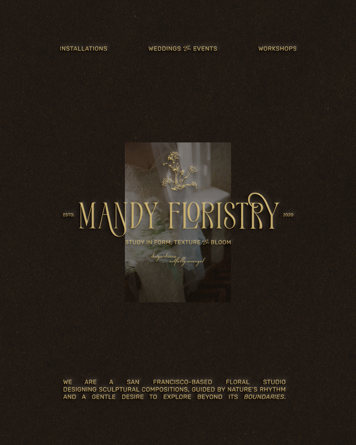
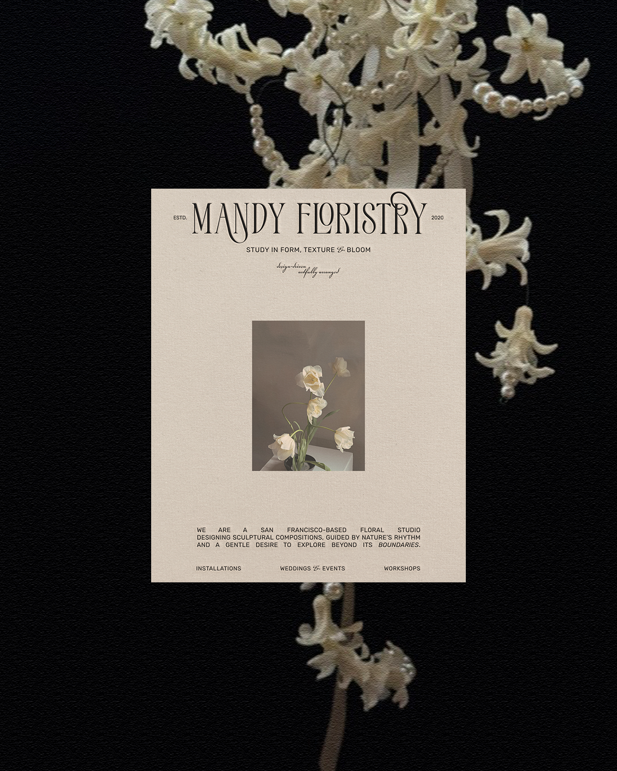
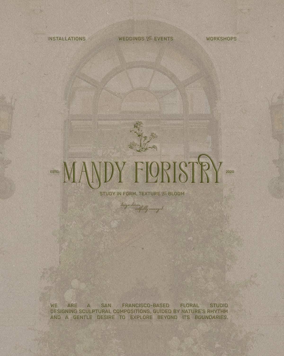
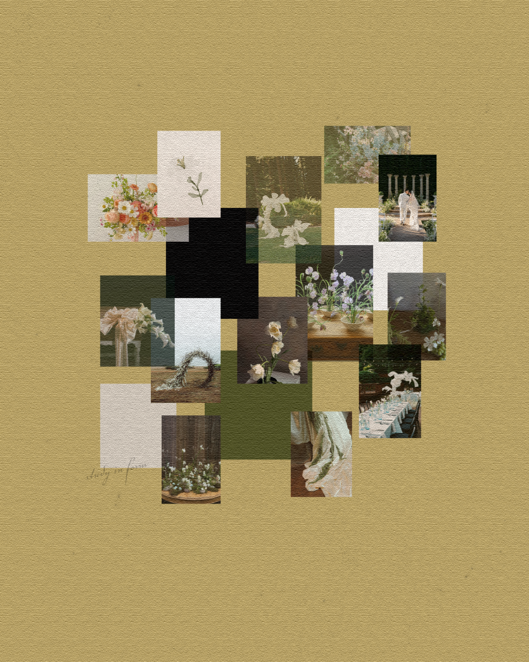
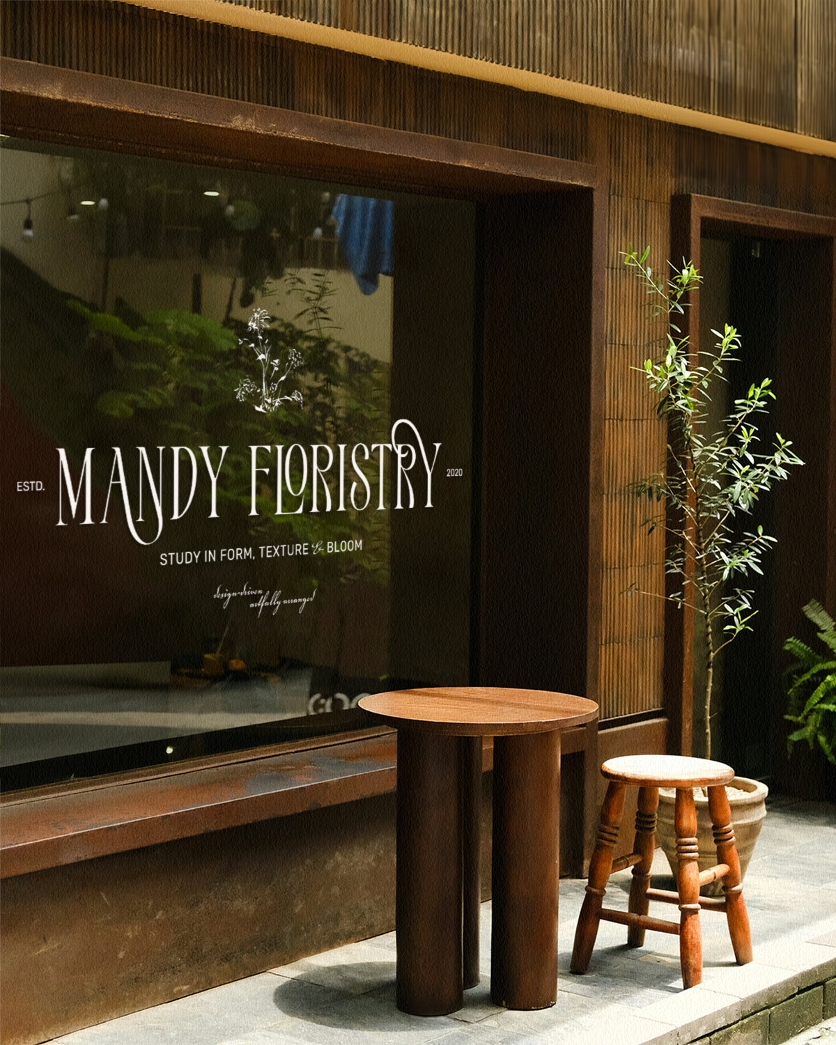
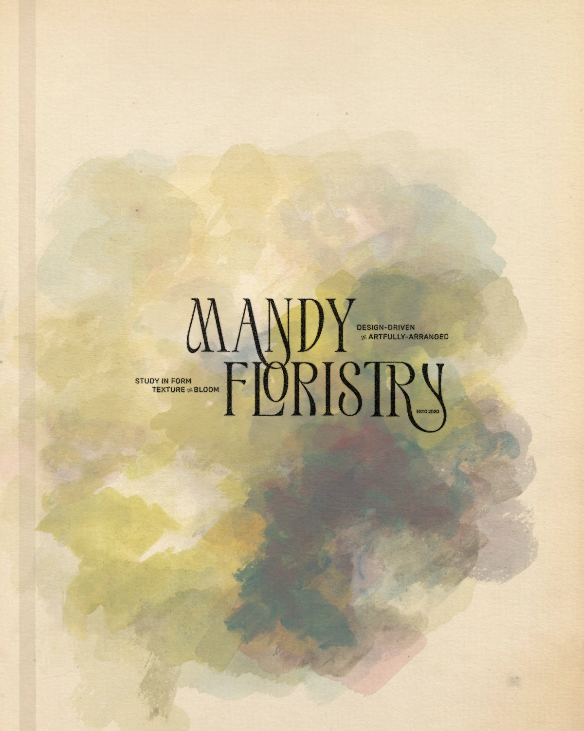
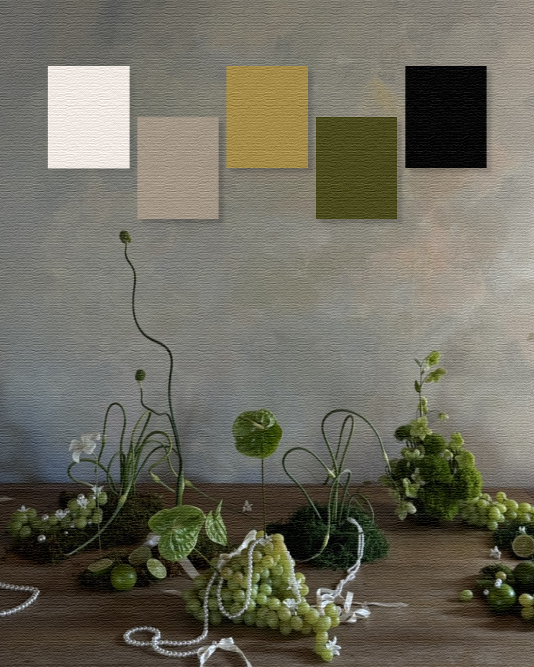
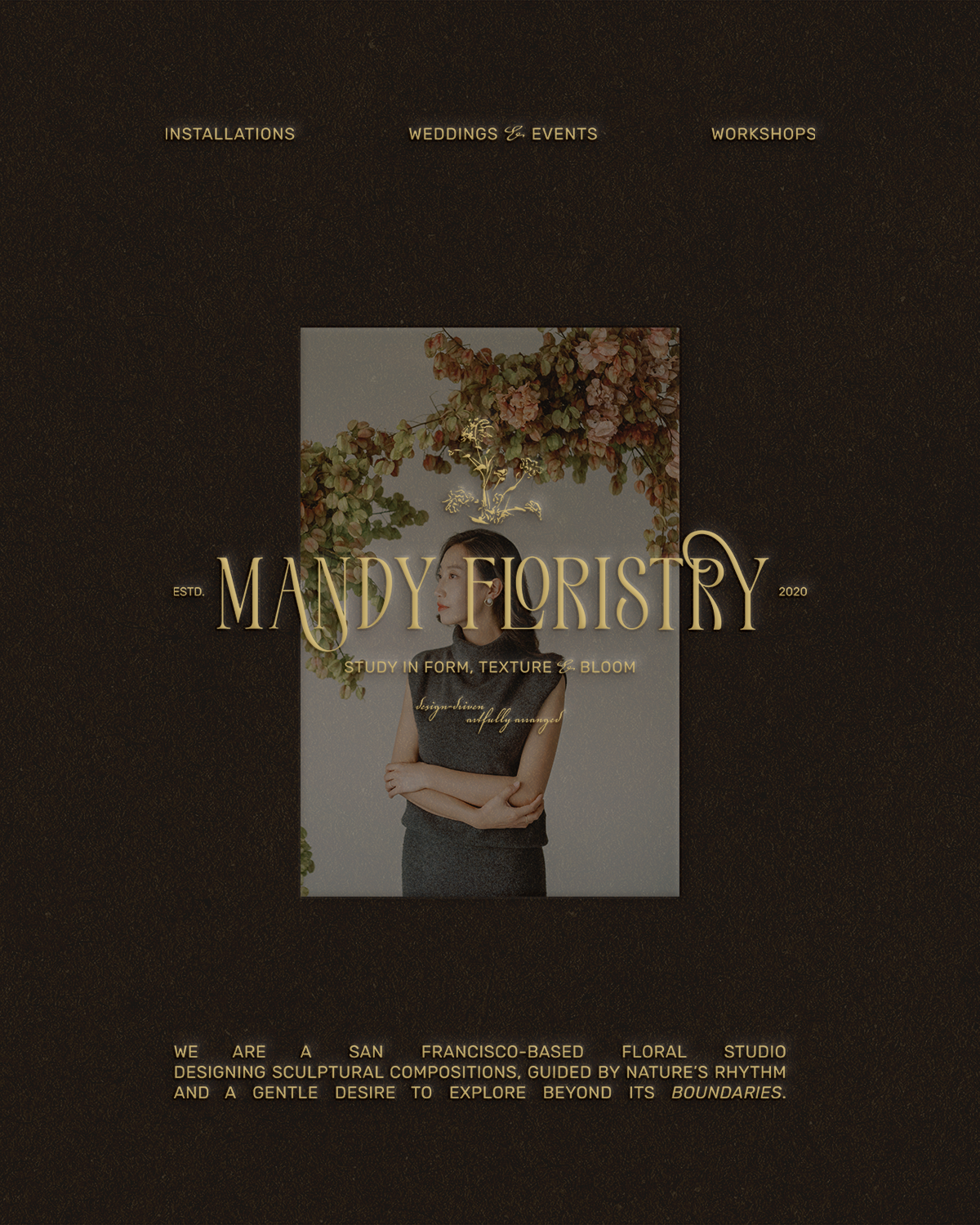
Mandy Floristry is a San Francisco–based floral studio designing installations, sculptural compositions for weddings and events, and workshops. Guided by nature’s distinctive rhythm and a gentle desire to explore beyond its boundaries, Mandy came to me seeking a brand identity that would position her as a trend-leading, influential floral designer, one who embraces various styles of floristry and encourages creative freedom when it comes to floral design. The project included a custom logo suite, typography system, colour palette, tagline creation, and supporting illustrative elements.
Brand Keywords: Confident, contemporary, relaxed, imaginative, refined, artistic, and unconventional.
“I had wanted to rebrand for years, but I kept waiting for the right timing and the right person. The moment I saw Savannah’s work, I knew she was it. Working with Savannah was seamless, collaborative, and incredibly inspiring. She has such a refined eye and an intuitive understanding of brand storytelling. Savannah guided the entire process with clarity, creativity, and so much intention. I’m beyond grateful for her talent and the care she poured into every detail. She truly pushed me to take the leap I had been dreaming about for years.”
– Mandy, Founder of Mandy Floristry
Intention
The intention was to create an elevated logo suite that reflected the design taste Mandy envisioned for her brand, while still going beyond what might be expected for her industry. In this case, the visual direction was rooted in the idea of florals as sculptural compositions. Inspired by wabi-sabi principles, the brand embraces organic movement, subtle irregularity, and negative space, creating a system that feels modern and art-led. Because her work itself is often considered expressive, it was important that her new logo suite felt complementary to her work rather than overpowering.
Process & Approach
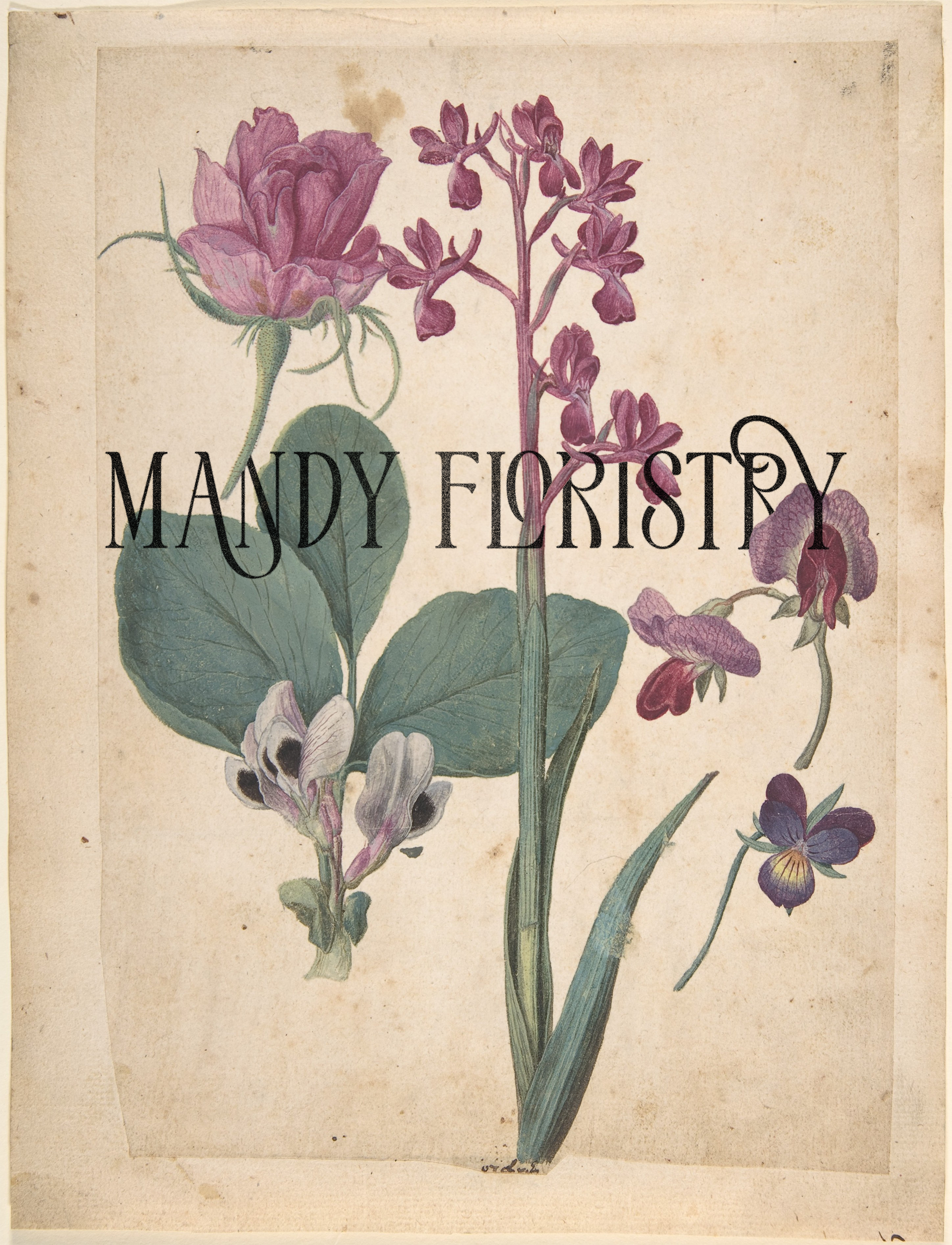
Rather than leaning into overtly traditional or highly decorative floral typography, we explored more fluid letterforms by first selecting a font featuring a heavier weight (moving towards tconfident than delicate, while creating custom ligatures and rounded curves, bringing in a sense of movement and play, while keeping the overall system clean and contemporary. The balance was to design a logo suite that was expressive enough to feel artistic, yet restrained enough to feel timeless.
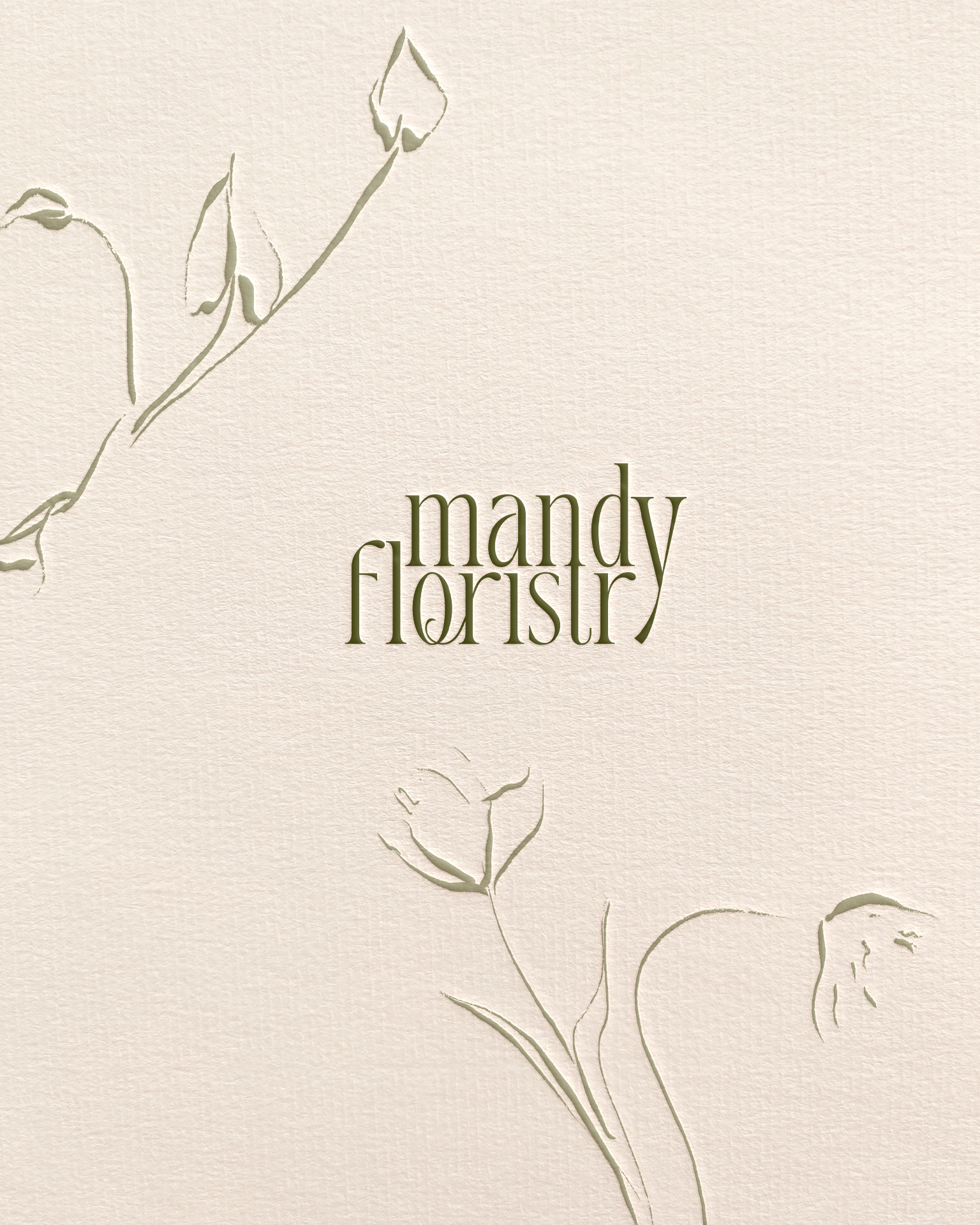
Each variation of the logo suite was designed with its own tone and purpose. Some marks feel more structured and refined, while others lean softer and more relaxed. A lowercase variation brings an especially approachable, contemporary feel, reinforcing Mandy’s openness and curiosity as a designer. Together, the suite allows the brand to shift and adapt, much like Mandy’s work itself.
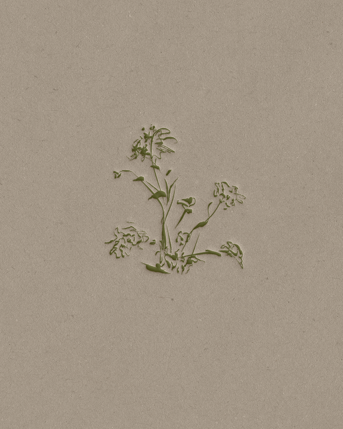
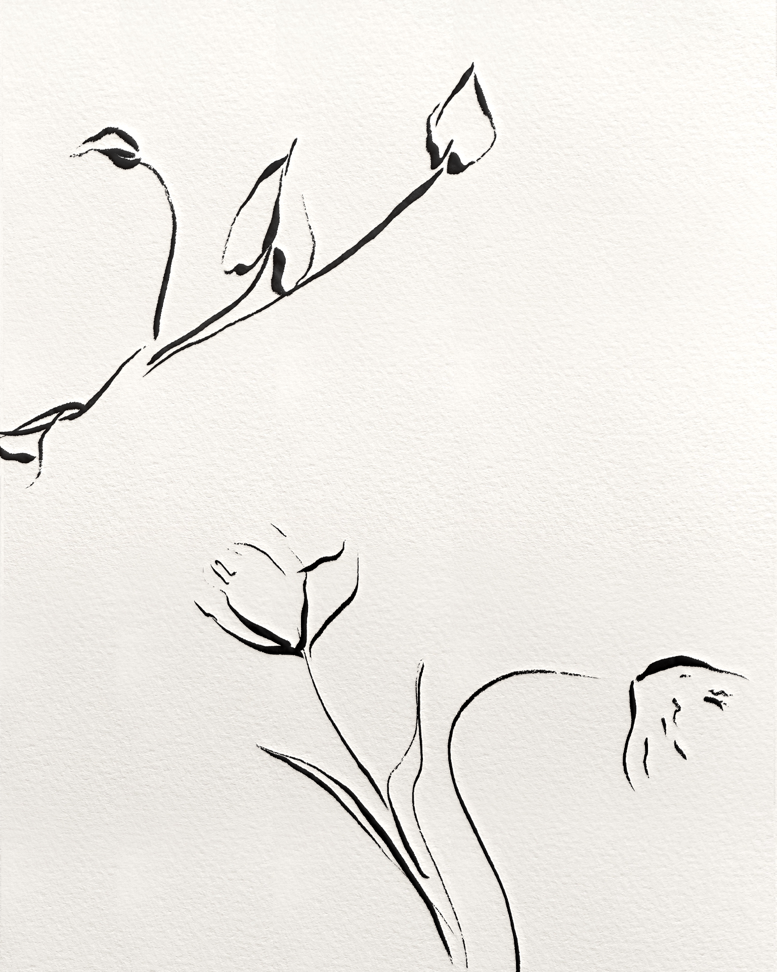
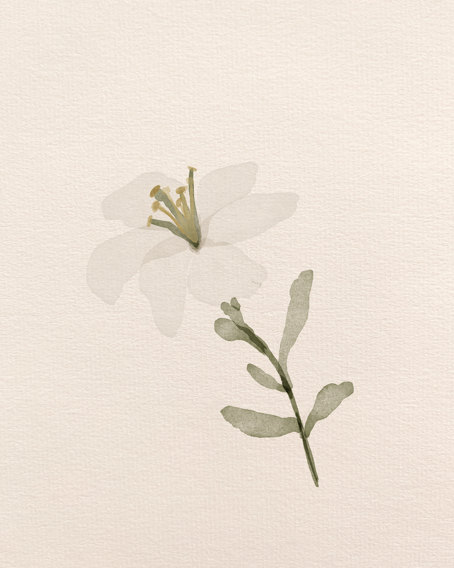
We also created a collection of custom, abstract-style illustrations designed to feel loose and unfinished, which were directly informed by Mandy’s real-life arrangements.
