
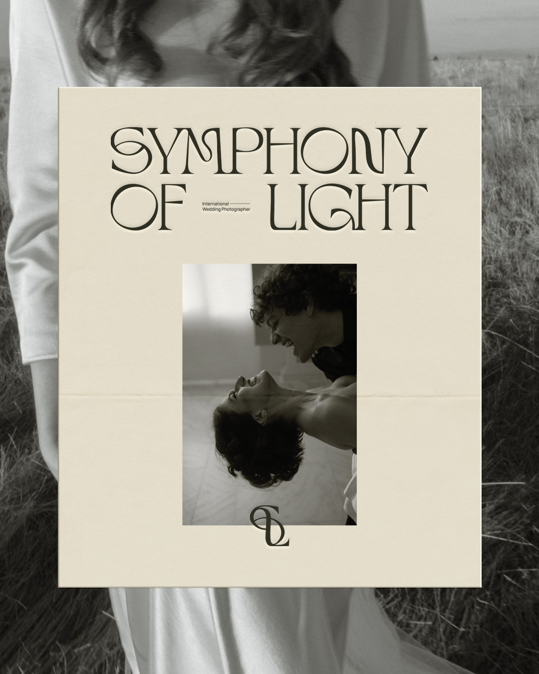
Custom Brand Design for Alex Vaidean, an international wedding photographer and founder of Symphony of Light. Rooted in a poetic, cinematic quality, this brand identity turned out to be a beautiful compilation of intrigue – think eclectic, unconventional, expressive, and full of feeling.
Keywords: Artful, Experimental, Romantic, Minimal, Eclectic, Fresh
“Working with Savannah was an absolute joy! As an international wedding photographer, I needed a logo that truly captured the essence of my brand, and Savannah delivered exactly that and more. “
The entire design process was incredibly thorough and thoughtfully creative. She took the time to understand not just my aesthetic preferences, but also the direction I want to take with my photography. I also loved how detailed the initial questionnaire was, followed by a comprehensive Creative Direction doc. The result was a stunning brand identity that stands out beautifully and gives a clear voice to my brand. I couldn’t be happier with the experience and the final product!
– Alex Vaidean, Founder of Symphony of Light
Intention
The intention for this project was to create a brand identity that feels both powerful and poetic, anchored by a distinctive logo that commands recognition at a glance. At its core, Alex wanted her new brand identity to embody the full essence of a “Symphony of Light”: a visual representation of timeless artistry, candid emotion, and a laid-back sense of luxury (while still keeping things casual and creative). It was also important to her that we find a way to harmonize both the feminine and masculine energetics of her brand. With that, we created a new brand identity that not only holds space for her as an artist but that supports her desire to grow as an international wedding photographer, booking more destination weddings across Europe.
Process & Approach
Visually, Alex’s brand sits at the intersection of artistry and individuality, blending minimalism with an edge of the unexpected. The minimal and contemporary foundation creates a sense of refined simplicity, yet within that simplicity lies an eclectic and intriguing spirit. Creating subtle ligatures, intentional letterform curves, and using a soft serif font base, we were able to incorporate a more feminine feel while still honouring the masculine (rounder letters, heavier weight, and shorter serifs).
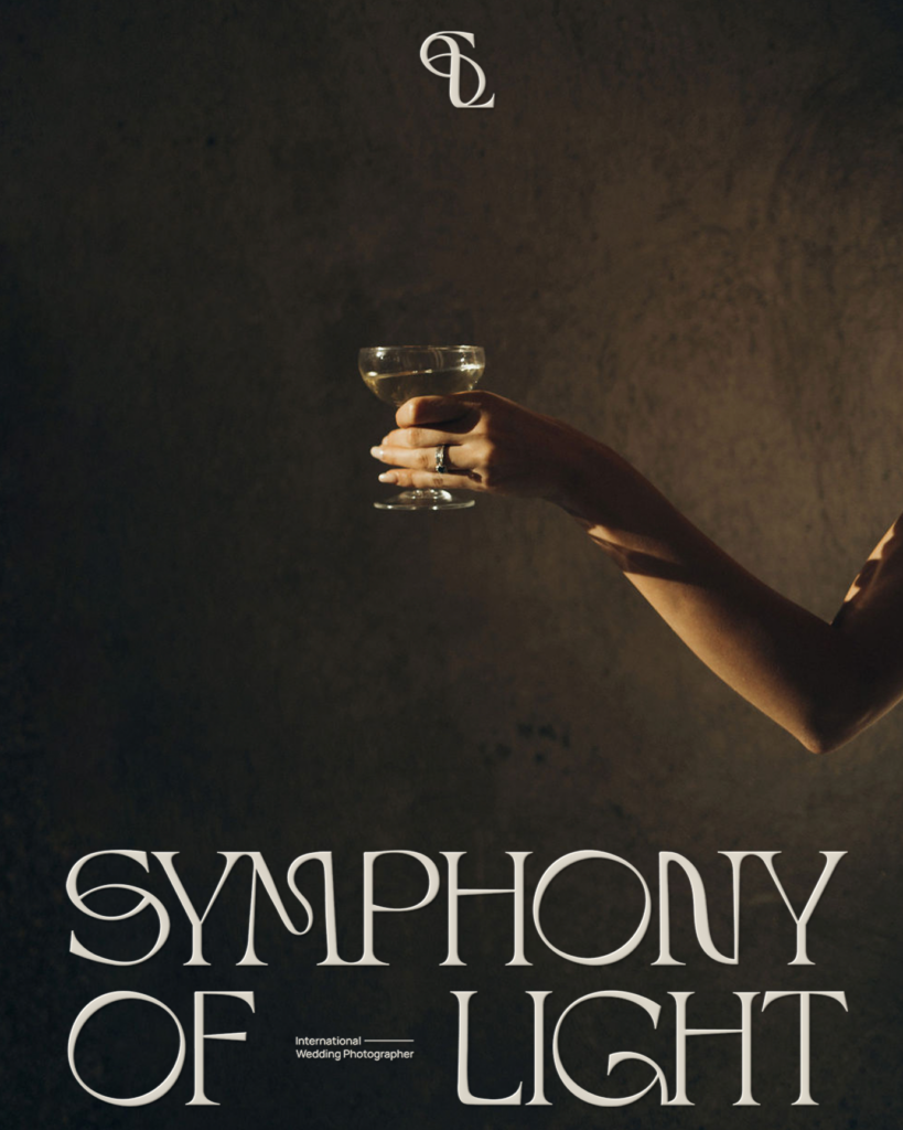
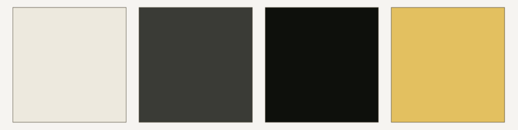
It was also important that her colour palette complements her overall work as a photographer. Because of this, we kept a more masculine, cool-toned, yet sophisticated colour palette such as charcoal greys, near blacks, cool beige, with a yellow accent – bringing in an energizing, creative, bold and romantic feel to her overall brand identity. We also took a somewhat abstract approach when designing her monogram, inviting room for a more interpretive brand experience.


Creative Direction & Design Strategy: Artisanth
Branding Assets Creation & Development: @__adelastudio, in close collaboration with Artisanth

