
An elegant and ethereal custom brand design for wedding photographer Jenny Renee. When Jenny first reached out, she was in a season of transformation, both personally and within her art form. As a wedding photographer, her work has always been rooted in emotion and connection, but she was ready to step into a new expression of her brand and business that felt more refined and intentional. Together, we set out to create a visual identity that mirrored the woman and artist she has become — one that is warm, romantic, and grounded, yet still carries herself with sophistication and grace.
Brand Keywords: Elegant, Soft, Dreamy, Artistic, Sentimental, Inviting
“Not to be dramatic, but I literally cried when I was reviewing the creative direction. I just knew that you would get it. This has been a long time in the making, and I am so excited. Thank you, thank you, thank you for all the time and hard work you’ve dedicated to helping me and perfecting everything for me. I seriously don’t know who else I could trust with this. I am truly swooning over everything. You truly get me.”
– Jenny Renee


Intention
For Jenny’s new brand identity, we leaned into an emotional tone that feels romantic, elegant, and inviting, with just enough refinement to speak to the elevated nature of her work. It was important that her clients not only see the beauty in her imagery but also feel deeply understood by the experience she offers (often romanticizing life, pouring her heart into her clients, and appreciating the beauty of art in all forms). Because of this, the brand needed to feel human and dreamy – a space where luxury and warmth could coexist naturally.
Process & Approach
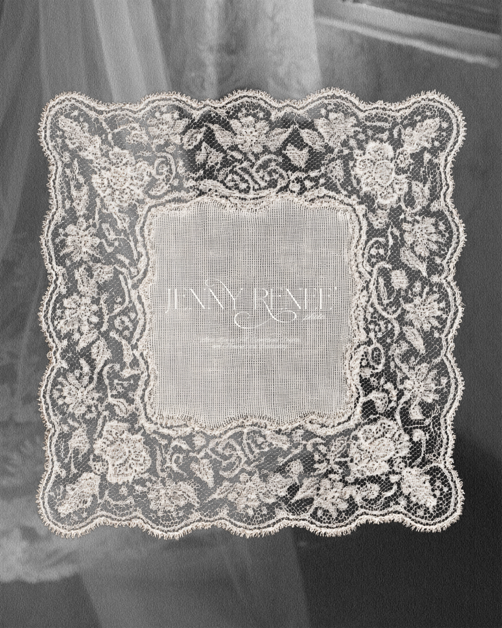
We began by exploring the balance between editorial polish and personal storytelling, allowing her brand to feel elevated but still kind and approachable. The foundation of the design lies in subtle contrasts: structured typography paired with delicate script accents, evoking both high-end professionalism and romance.
The colour palette blends cool earth tones with soft, romantic neutrals, inspired by aged linen, vintage paper, and dusky florals. These tones complement the natural hues often found within Jenny’s photography as well as the landscapes she photographs.
Her logo suite was designed to mirror her evolution: a refined serif-based wordmark paired with a delicate monogram that feels both poetic and personal. The primary logo holds space for elegance and clarity, while the monogram offers intimacy and charm.
To bring a layer of symbolism and character-driven storytelling, we introduced hand-drawn illustrations that hold deep personal meaning: a blue morpho butterfly, representing transformation and lightness, and olive branches, symbolizing faith and renewal (a journey she’s been experiencing the last little while). The butterfly, once part of her earlier branding, was intentionally reimagined to reflect her growth — a thread that connects her past to her present.
Together, these elements form a brand that feels like an extension of Jenny herself. It’s a visual language that captures her artistry and heart in equal measure.

