
An expressive, dynamic, and editorial custom Showit brand and website design for Anna Dunlop, a Scotland-based wedding photographer and Super 8 videographer.
Based in Scotland, Anna specializes in both digital and analogue wedding photography and Super 8 filmmaking, documenting celebrations through a perspective deeply informed by her fine art background. The intention behind this custom brand and web design project was to create a visual identity and online experience that felt immersive, culturally aware, emotionally perceptive, and compositionally thoughtful – while still remaining approachable and personal. This collaboration included custom brand design, custom website design, and complimentary website copyediting.
Keywords: Confident, Imaginative, Dynamic, Daring, Refined, Contemporary, Grand, Fresh, Expressive
“Be prepared to think deeply about your business and what makes it unique. The process goes far beyond visuals. If you’re willing to be honest, reflective, and open to the process, you’ll come away with a brand that feels authentic and genuinely representative of who you are. The more you give to the process, the more aligned the outcome will be.”
I literally gasped when I saw the initial website design – and it just got even better from there. It feels amazing to be ‘seen’ and to have your work + ethos contextualised in such a tangible way. It really feels like an authentic reflection of where my business is today whilst also creating space for where I hope it will grow. Savannah has an incredible ability to listen, ask insightful questions, and translate abstract ideas into something tangible, cohesive, and beautifully considered. Throughout the process, I felt genuinely seen and understood. Savannah has a real talent for uncovering the heart of a brand and bringing it to life in a way that feels both strategic and deeply personal. Beyond her creative skill, her energy was such a joy to be around. From the very beginning, her enthusiasm for the project and genuine excitement about collaborating was impossible not to be swept up in. She brought so much encouragement, perspective, and positivity throughout, making me feel confident in both the decisions we were making and the direction we were heading. It always felt like she was just as invested in creating something meaningful as I was. The final result feels authentic, intentional, and completely aligned with who I am as both a person and a business. I couldn’t be happier with the experience, or the outcome, and I’m incredibly grateful for the care, creativity, and thoughtfulness she brought to every stage of the journey.
– Anna Dunlop
Intention
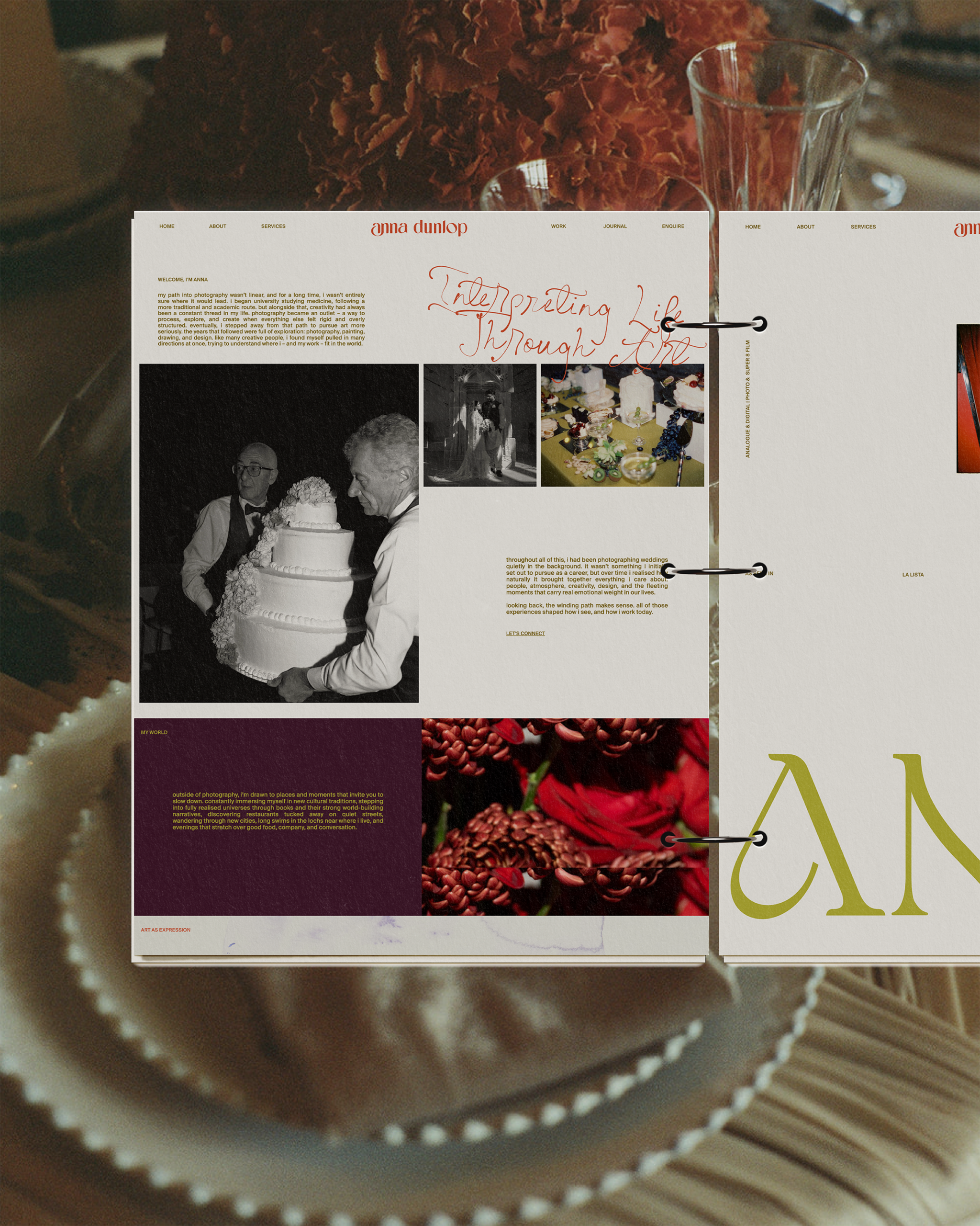
From the beginning, it was important that Anna’s brand moved beyond the expected – somewhat romantic and feminine – aesthetics often seen within the wedding industry. Her work naturally balances documentary honesty with an editorial eye for composition, design, movement, proportion, light, and atmosphere.
Coming from a fine art background, Anna approaches weddings with an instinctive understanding of how energy exists within a space and how design details greatly contribute to the overall atmospheric environment. Because of this, the brand needed to communicate not only trust and professionalism, but also artistry and unconventional interpretation.
It was important that when clients enter her space, they feel both at ease and excited. She also wanted them to feel grounded by her easy-going presence, yet deeply curious about the way she sees the world.
The overall goal was to create a wedding photography and videography brand that:
- Elevated her positioning within the luxury and design-conscious wedding market
- Created a stronger emotional connection and brand recognition
- Showcased both digital and analogue work cohesively
- Highlighted her Super 8 films through movement-led design
- Generated more aligned inquiries through intentional storytelling
- Felt deeply personal, expressive, and culturally fluent
Process & Approach
One of the defining directions of the brand came from Anna’s free-spirited, “go with the flow” nature. Rather than interpreting that as overly soft or whimsical, we approached it through the lens of confidence and instinct.
Typography played a significant role in shaping this balance. We paired a modern lowercase sans serif with a more unconventional accent font that feels bold, artistic, and slightly unconventional. The contrast creates tension in a way that feels contemporary and self-assured – mirroring Anna’s ability to move fluidly between analogue nostalgia and modern editorial storytelling. The lowercase typography also subtly reflects her natural tone of voice and way of texting, which feels conversational (while still leaning into a design choice that is deliberate yet unexpected.
Throughout the website, we incorporated her real artwork and fine art references to reinforce the foundation of her creative practice. These details helped position the brand beyond “wedding photography” and into something that feels more immersive, curated, and culturally connected.
Fashion also became a major reference point throughout the design process. We wanted the website to feel almost like moving through a lookbook or independent print publication – image-led, directional, and emotionally evocative. This influence shaped the layouts, pacing, typography hierarchy, and use of movement throughout the site.
Because Super 8 film is such an important part of Anna’s work, we created multiple moments throughout the site where motion could become part of the storytelling experience. Rather than treating video as an afterthought, movement became foundational to the user experience itself.
The layouts were designed with a strong editorial sensibility:
- Spacious composition
- Intentional asymmetry
- Layered visual storytelling
- Large-scale imagery
- Cinematic pacing
- Dynamic transitions and movement
At the same time, usability and clarity remained central to the process. The website needed to support inquiry generation while still feeling artistic and exploratory. We carefully balanced immersive visuals with strategic structure, ensuring potential clients could easily move through the experience while becoming emotionally invested in the work.
Lastly, the colour palette remains one of the key characteristics of Anna’s branding, further developing the emotional layers that exist as part of her art by introducing elements of drama and contrast.
“I expected a beautiful brand and website, but i didn’t expect to leave with such a strong understanding of my values, positioning, voice, and long-term direction.”
What began as a rebrand and website project became a much deeper process of understanding my work, values, and vision. I was looking for more than just a beautiful website. I wanted a brand and online presence that felt genuinely reflective of who I am, how I work, and the type of experience I hope to create for my clients. It was important that the design felt intentional, elevated, and editorial, whilst still retaining warmth and personality. I wanted something that would help me articulate ideas and values I already held, but perhaps hadn’t yet found the language for. Working with Savannah was one of the most valuable investments I’ve made in my business. I had followed her work for a while, and of course I initially fell in love with it for the beautiful visuals, but the more I looked into her + your work, the more I felt her artistry + good energy. I felt that she understood the balance I was trying to achieve: artistic but approachable, refined but deeply human. Her work feels thoughtful rather than trend-led, and I could see the care and strategy behind every decision. It’s clear how much care, attention, and thought goes into what she does. There are so many elements that I enjoyed in what was really such a seamless and stress-free journey. I can’t wait to collaborate with Savannah again in the future.
– Anna Dunlop


