
An organic, understated, earthy, and wabi-sabi-inspired custom brand and web design for Michigan-based Florist, Drifter Floral.
And although we designed this space specifically for Madison, we’re happy to share that the web design is now available for purchase – shop our newest Showit template, Terre Verde.
Keywords: Grounded, Genuine, Artistic, Natural, Inspired, Down-to-Earth.
“You truly will not find a better, more thorough web design studio. The value of the service and product is worth every dollar invested. I honestly think it would be a waste of time and money to have anybody else create a brand and website.”
Every design you’ve created is so personal and unlike other websites. I could tell immediately how thoughtfully designed the website and brands were, and after deciding to work together, I can honestly say I LOOOOVE it!! It genuinely exceeds my expectations. I love how it truly feels 100% unique. I love how we used personal inspiration over other brand inspiration. It makes the brand feel completely personal. I have already gotten so many compliments on it – actually so many! From people online and in person. I feel lighter knowing that I can be confident in my website and brand. That is something that has been weighing on my head for a long time. This process has given me more motivation and excitement about my business. A few days after the launch, I told my husband that I actually miss communicating with you – it was so nice to work with someone who cared so much about the project. You add such a caring touch to the process that others don’t, and you are also extremely talented and good at what you do. 10/10.
– Madison, Founder of Drifter Floral
Intention
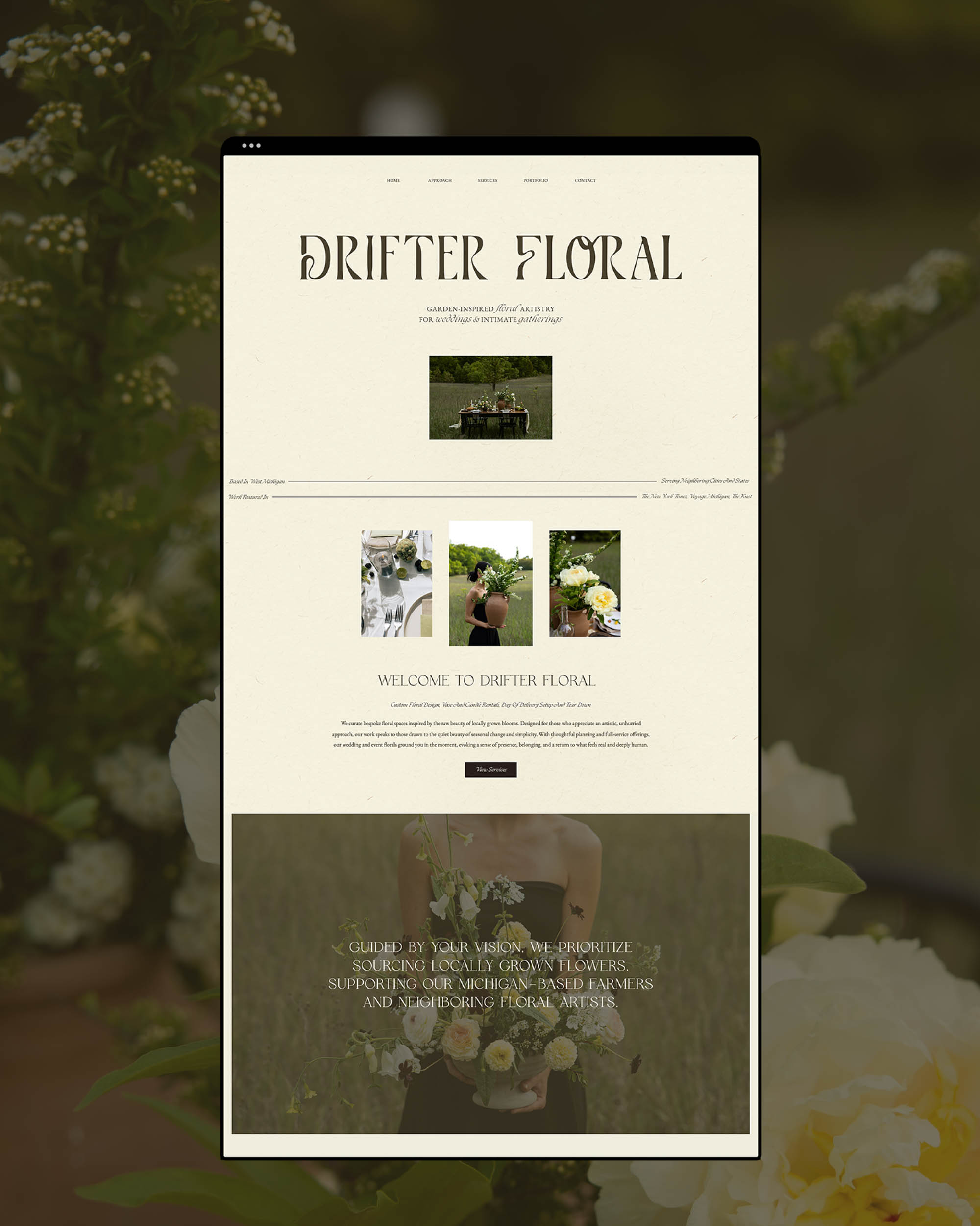
When Drifter Floral came to us, she knew she didn’t want to be seen as just another traditional florist. Her vision was to create floral experiences that felt grounded, natural, and deeply connected to people and place. She wanted a brand and website that would reflect her artistic, organic approach while still feeling elevated and professional – a brand that would resonate with clients looking for something meaningful and design-conscious.
Some of her key intentions included attracting ideal clients with higher budgets of $10-15K, creating an elevated and cohesive brand aesthetic that felt exclusive yet approachable, and developing a website that would be easy to navigate, rank well in search engines, and prompt visitors to inquire with confidence.
Together, we wanted to design a brand and online presence that honoured her wabi-sabi-inspired philosophy – celebrating imperfection, seasonality, and the quiet beauty of what feels real – while positioning her as an expert florist and artist in her region.
Process & Approach
From the beginning, we rooted our creative direction in her brand’s emotional keywords: grounded, calm, supportive, genuine, and artistic. Her work is shaped by what nature offers rather than what tradition expects, and we wanted every aspect of her brand and website to reflect this ethos.
For the Brand Design –
Inspired by wabi-sabi, the visual identity embraces imperfection, seasonality, and the quiet magic of things that feel real. The aesthetic leans into a free-flowing, wild garden feel – loose, whimsical, and never too structured – communicated through natural textures, earthy colours, and organic forms. For her logo suite, we created a neutral, Earth-inspired wordmark using a slightly serifed mid-weight typeface customized with intentional, weathered curves that align with the flow of a river. The curve in the “t” for example, is designed to feel weathered by nature, while subtle ligatures between the “O” and “R” symbolize connection – to the land, to people, and to each other. The overall weight of the wordmark evokes the grounded, confident energy of aged stone inscriptions or wood carvings: artistic yet earthy. Nothing overly bold or romantic.
We also designed an abstract river submark inspired by the Muskegon River in Michigan, a subtle nod to place and flow. The warm, grounded palette of sand, olive, moss, and deep brown creates a calm, understated foundation that reflects her design philosophy while allowing her floral artistry to remain at the forefront.
For the Web Design –
We approached her website layout as we would a floral arrangement – shaped by what feels most natural and intentional. The design prioritizes clarity and warmth, with generous white space creating a gentle visual rhythm that feels unhurried and peaceful. Content flows naturally with quiet moments of pause, guiding visitors without overwhelming them. This visual narrative once again, embodies the wabi-sabi philosophy, celebrating beauty in imperfection and life’s transient nature.
Overall, this project became an intentional reflection of her grounded artistry and gentle presence, positioning Drifter Floral as a brand that not only designs beautiful florals but invites clients into an experience rooted in meaning, belonging, and the quiet beauty of the land itself.
“If I knew how great the experience would be and how beautiful the website and brand would turn out, I would never think twice about the investment.”
Creating a new brand and website had been on my to-do list for a while, and I had never found a business that I trusted to work with. As soon as I came across Artisanth, I knew I wanted to work with them immediately. Savannah is extremely talented and detail-oriented. She is so kind and thoughtful. The process was clear and easy to navigate. Savannah is intentional about understanding your brand- aesthetically and from a business side. After the process, I feel more confident and excited about my business. I also feel like I understand my brand so much better than I did before. The finished product is better than I could have imagined. It is personal and exactly what I was hoping for, while still being focused on my clients and their needs. Savannah gives you all the tools you will need to succeed. I am so happy with the investment and the final product! Thank you!


