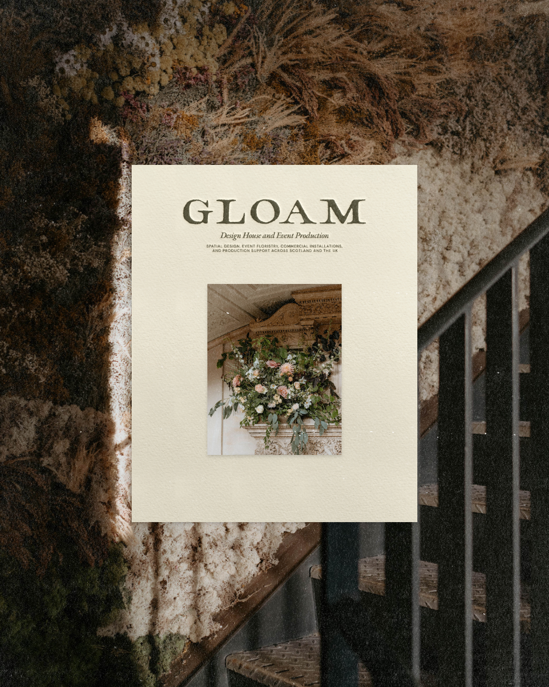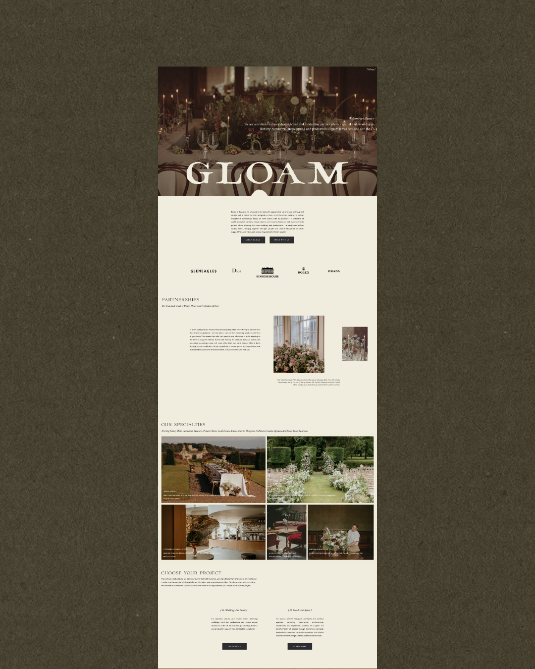
An all-encompassing brand transformation for Gloam – a design house and production partner offering spatial and event design, floristry, commercial installations, and production support across Scotland and the UK.
When the team at Gloam first reached out, they were ready to step into a bigger version of themselves. Already working across weddings, events, floristry, furniture, installations, and production, their work had grown far beyond what their existing brand and website were communicating. The goal was to create an all-encompassing brand experience that could hold the breadth of what they do, while making their position as a design house and production partner much clearer.
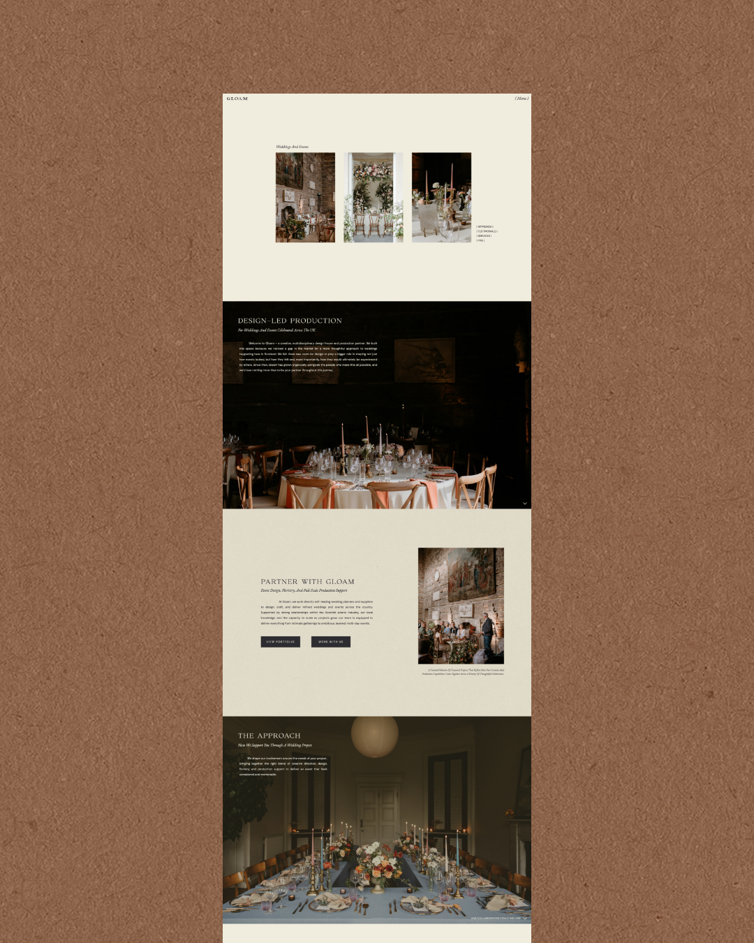
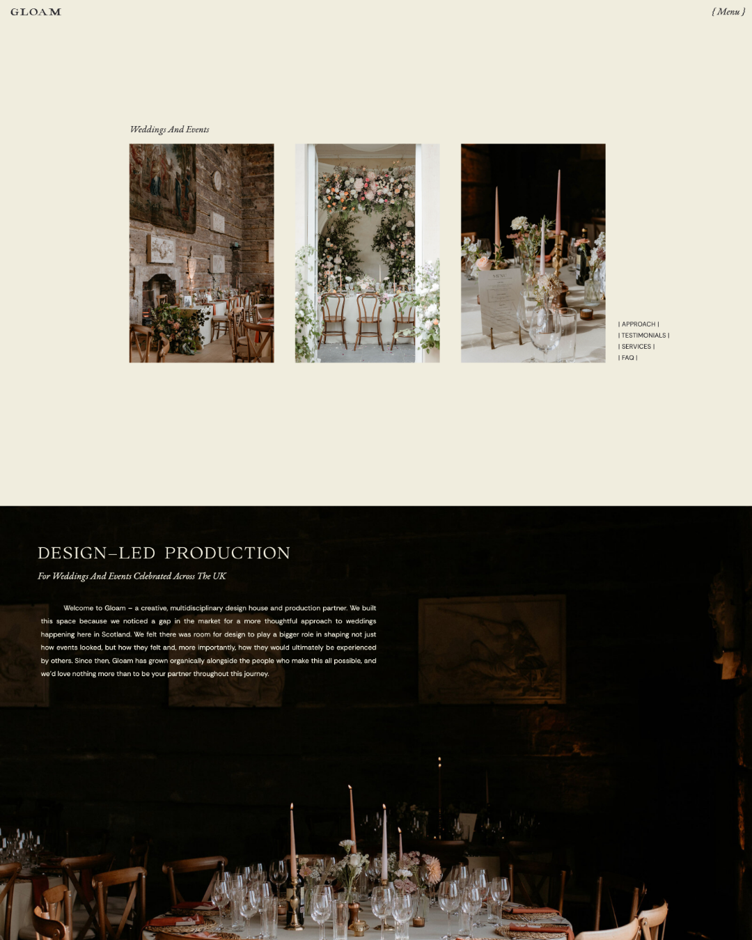
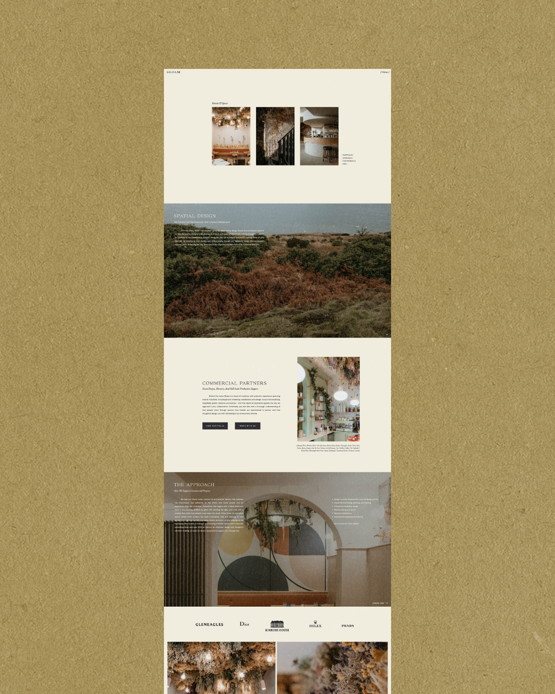
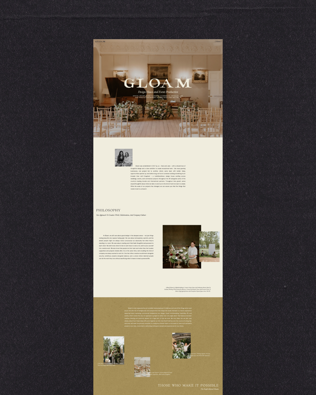
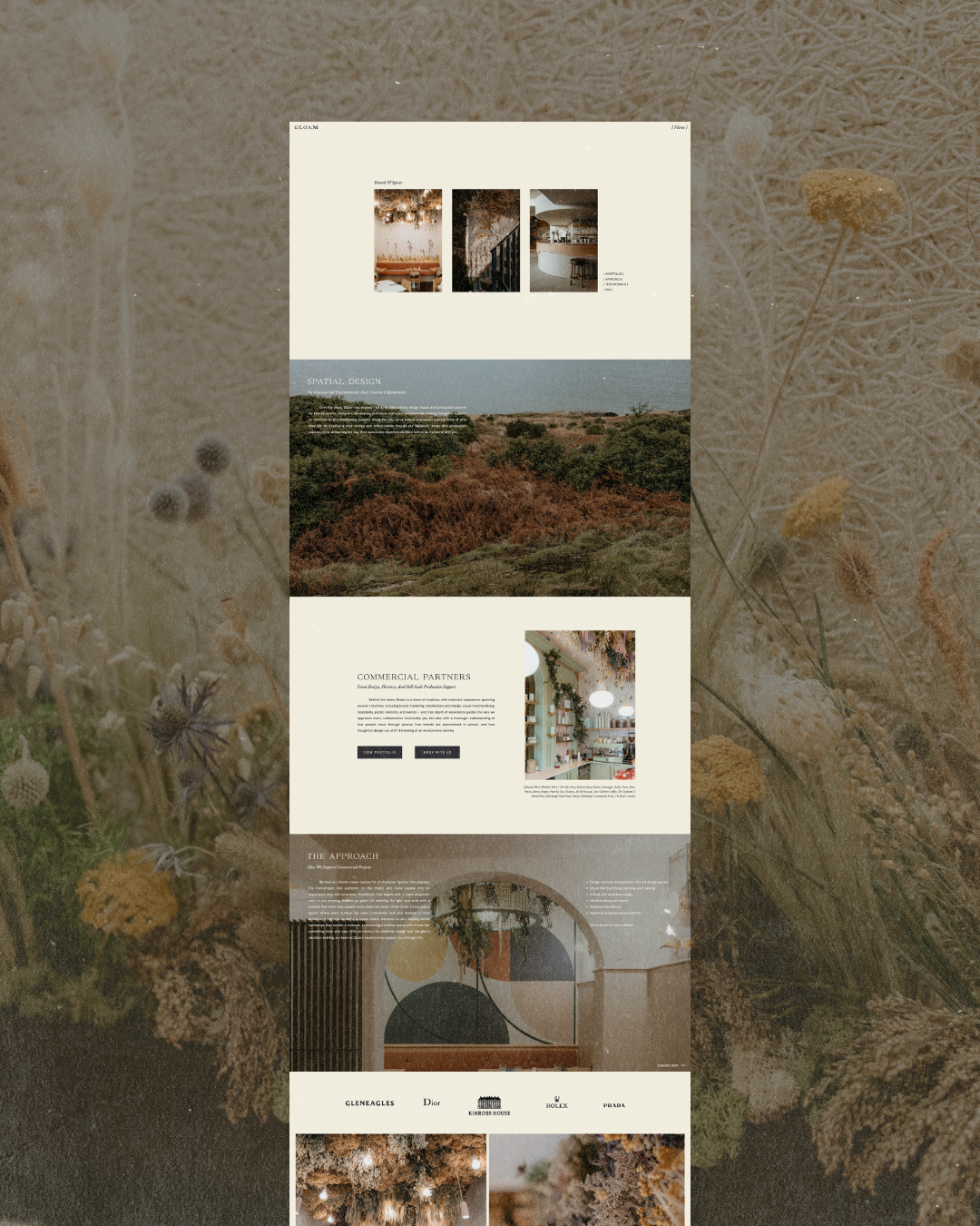
Together, we refreshed their brand, developed custom copy and messaging, and created a completely custom website rooted in intentional client journeys, one that gives their work room to speak while making it much easier to understand where they fit, how they can partner, and just how far their capabilities can reach.
Keywords: Grand, Understated, Elevated, Inviting, Warm, Confident, Architectural, Luxe.
“The brand and website have had an Artisanth glow-up. Thanks, Savannah, you’ve captured us wholly and completely. We could not be more delighted with the site. Thank you a million times!“
Full In-Depth Review Coming Soon…
– Jean Marra, Co-Founder of Gloam
Intention
The conversation began with a feeling that Gloam had outgrown the way they were presenting themselves. Their existing website leaned heavily toward weddings while placing the couple at the centre of the experience, which naturally made Gloam feel more like a wedding planner than the multidisciplinary design house and production partner they had become.
But their ambitions were bigger. They wanted to be considered by leading Scottish venues, destination planners, designers, architects, and production partners across the UK and beyond, particularly for larger, more layered projects that could span multiple days, spaces, and disciplines (especially since they were already doing much of this work behind-the-scenes).
With that being said, our challenge was that much of that substance was sitting quietly beneath an aesthetic-first presence, which made it clear that our intention became twofold: to clarify what Gloam does, and to create a brand experience that reflects the level at which they operate. Rather than asking a potential client to navigate a long list of services and decide what they need, we looked at the experience from their perspective. What are you planning? What kind of project are you bringing to us? And, from there, how can Gloam become part of making it happen?
Our priority was to make the path into Gloam feel simpler, while letting the work itself feel much bigger.
Process & Approach
With every all-encompassing project, we began with the words. Through custom copywriting, we shaped a clearer position for Gloam as a design house and production partner, developing the language, positioning statements, taglines, service descriptions, and case studies that would give the brand more substance and authority. That messaging then became the foundation for the website strategy.
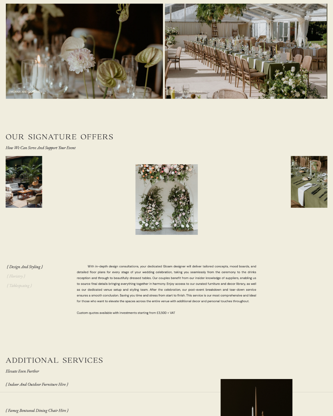
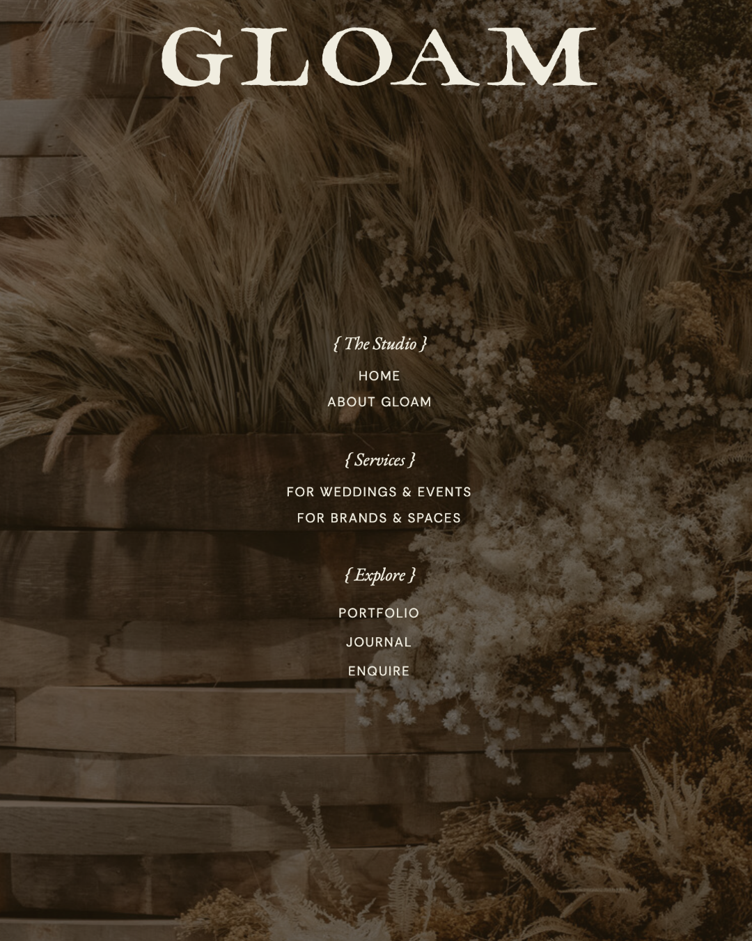
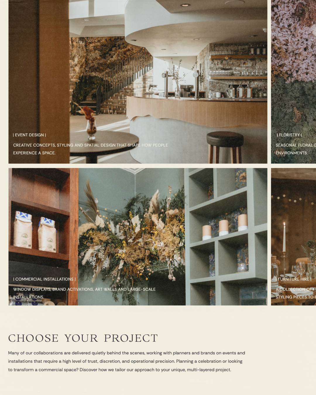
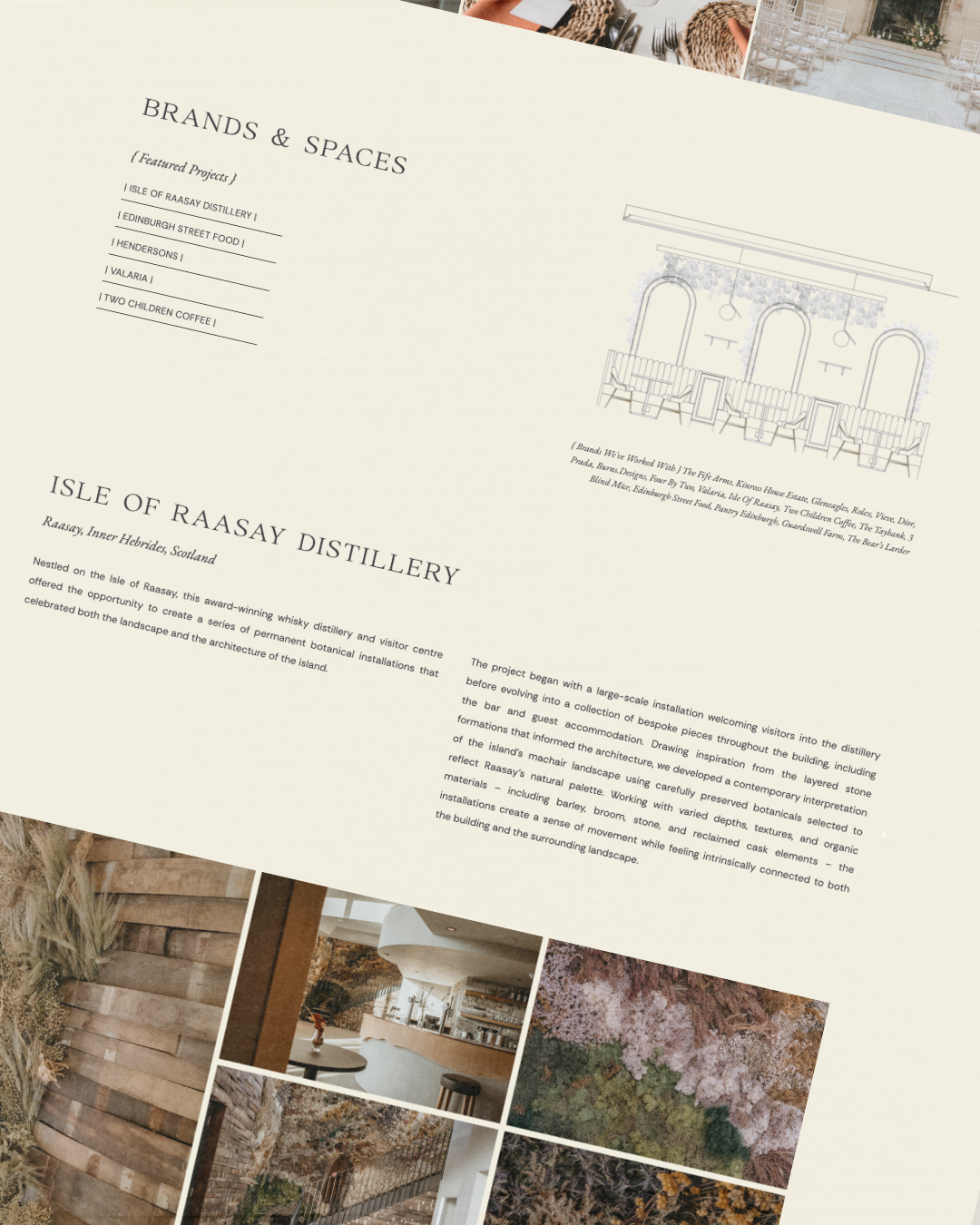
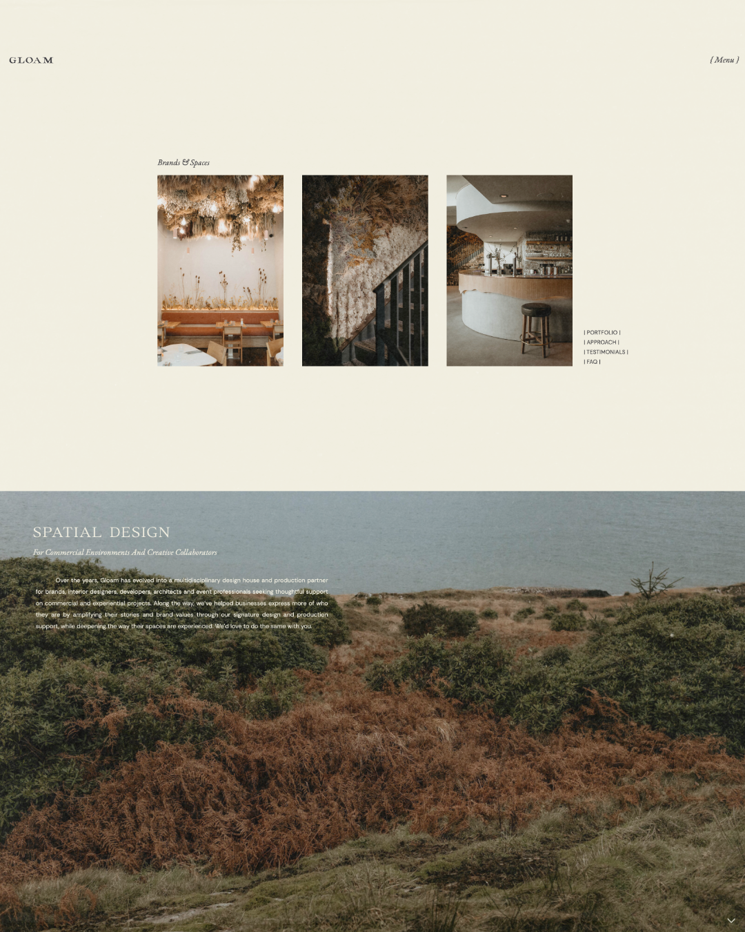
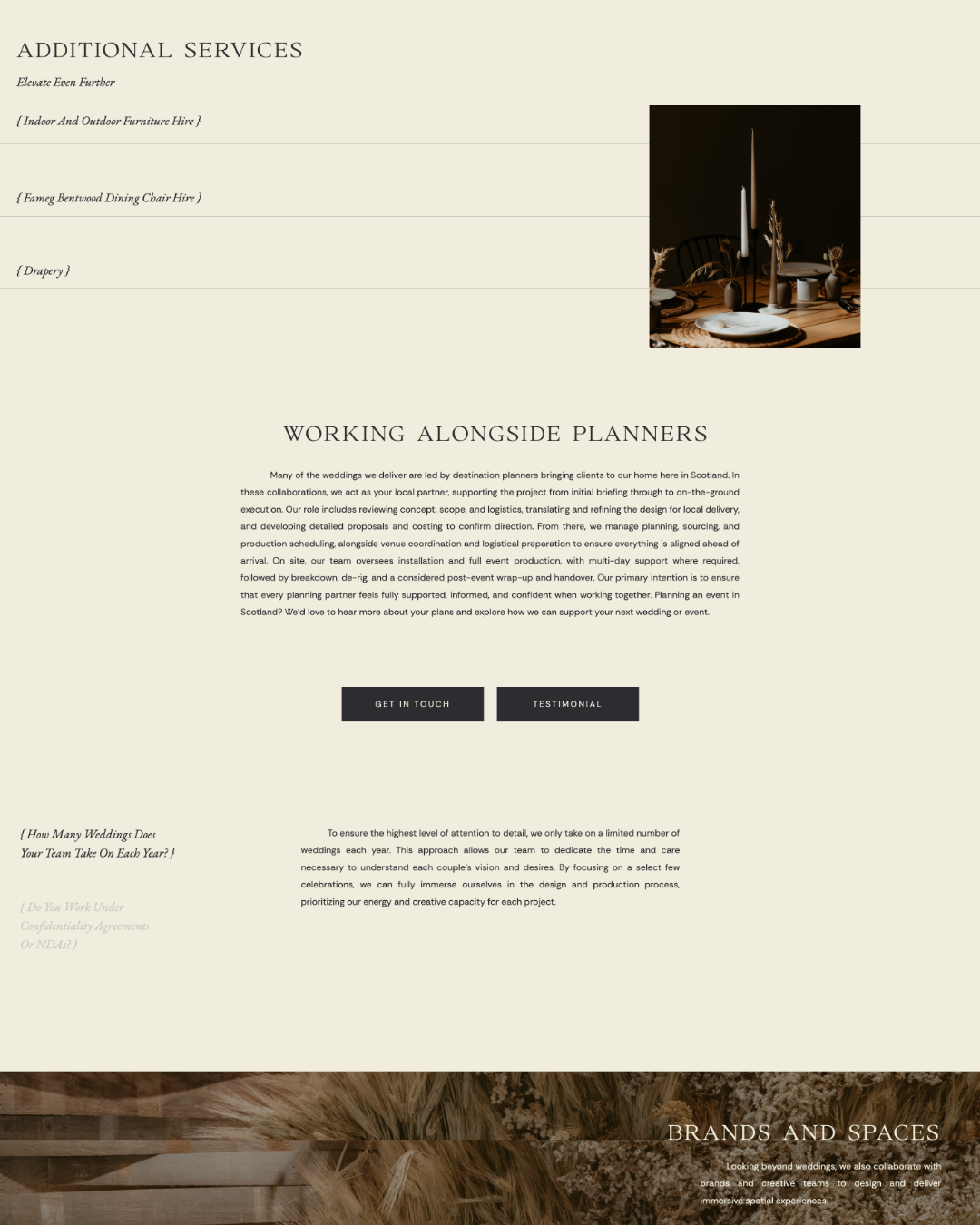
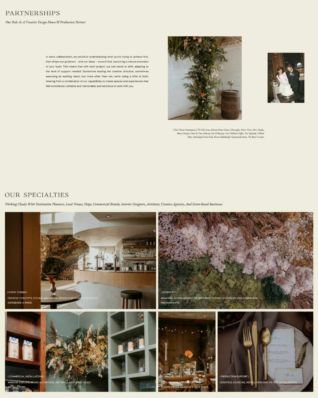
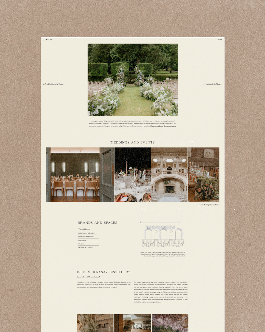
Instead of organizing the experience around individual services, we created distinct pathways for Weddings & Events and Brands & Spaces, allowing visitors to find their way in based on the kind of project they were planning rather than needing to understand Gloam’s entire offering upfront. From there, we could naturally introduce the many ways Gloam can contribute – from floristry and event design to furniture hire, installations, logistics, and production support.
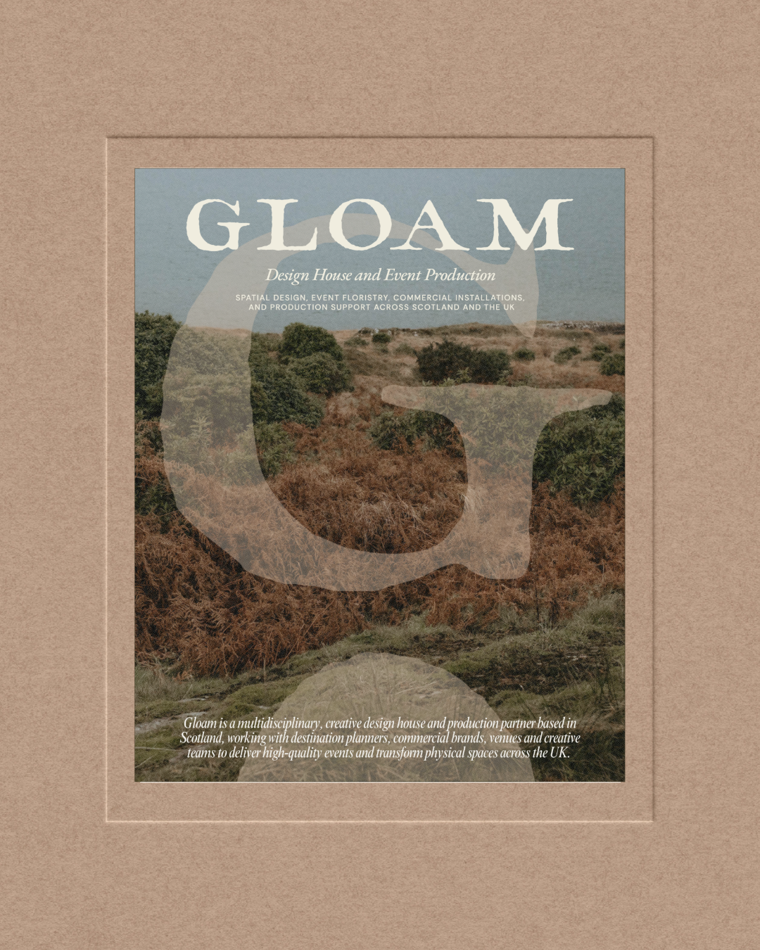
Visually, the brand refresh was less about changing Gloam completely and more about uncovering what was already there. Inspired by the meaning of gloam — that quiet transition between sunset and darkness — we refined their existing palette into something more muted and atmospheric, moving away from its previous bohemian feeling and toward something softer, deeper, and more enduring.
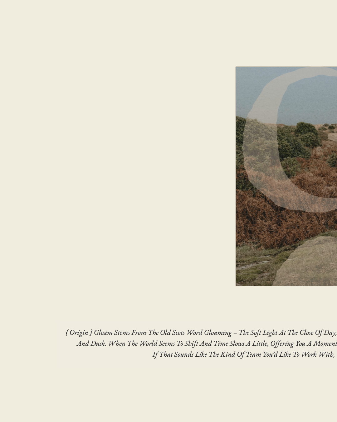
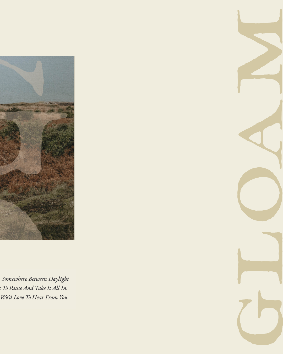
Here’s a little bit of copywriting that we wrote and included on their website: Gloam stems from the old Scots word gloaming – the soft light at the close of day, somewhere between daylight and dusk. When the world seems to shift and time slows a little, offering you a moment to pause and take it all in. If that sounds like the kind of team you’d like to work with, we’d love to hear from you.
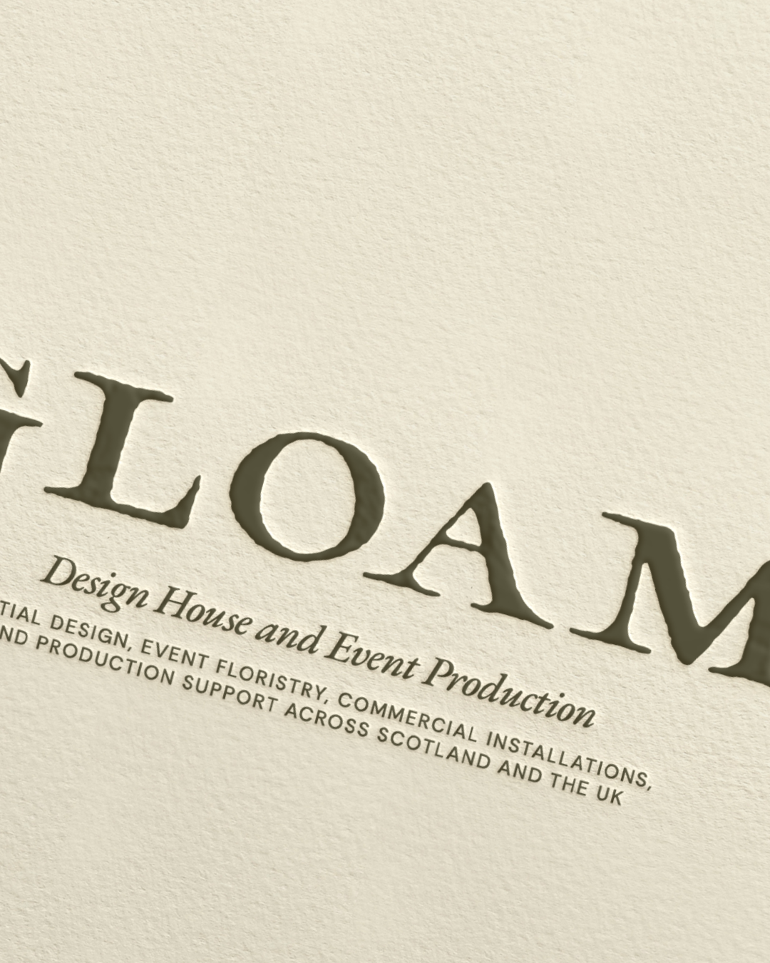
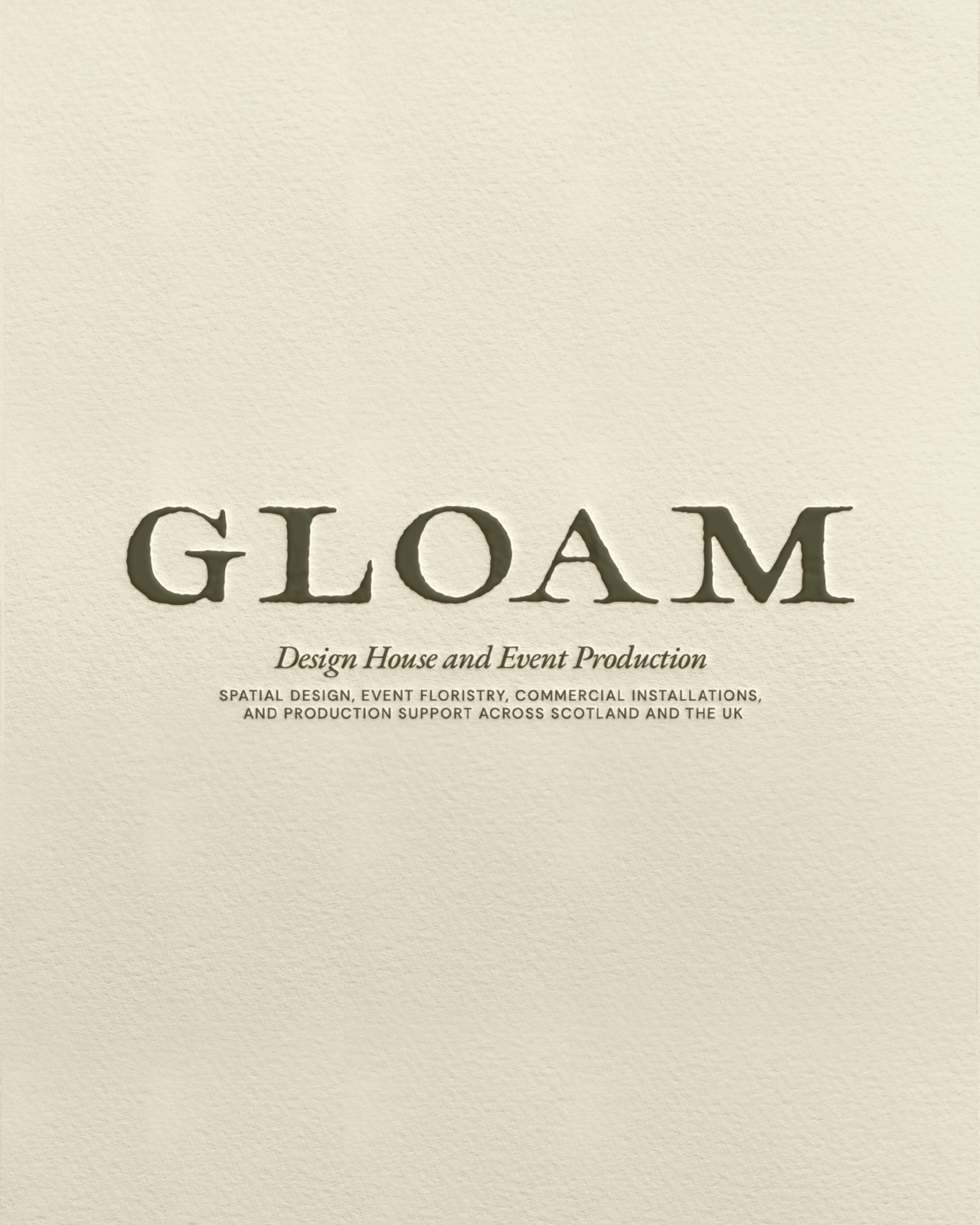
The logo suite followed a similar approach. We retained the familiarity of the original marks while refining and customizing it to feel more considered and established – almost like something weathered over time. The visual language became a balance between authority and warmth and history/heritage and modernity.
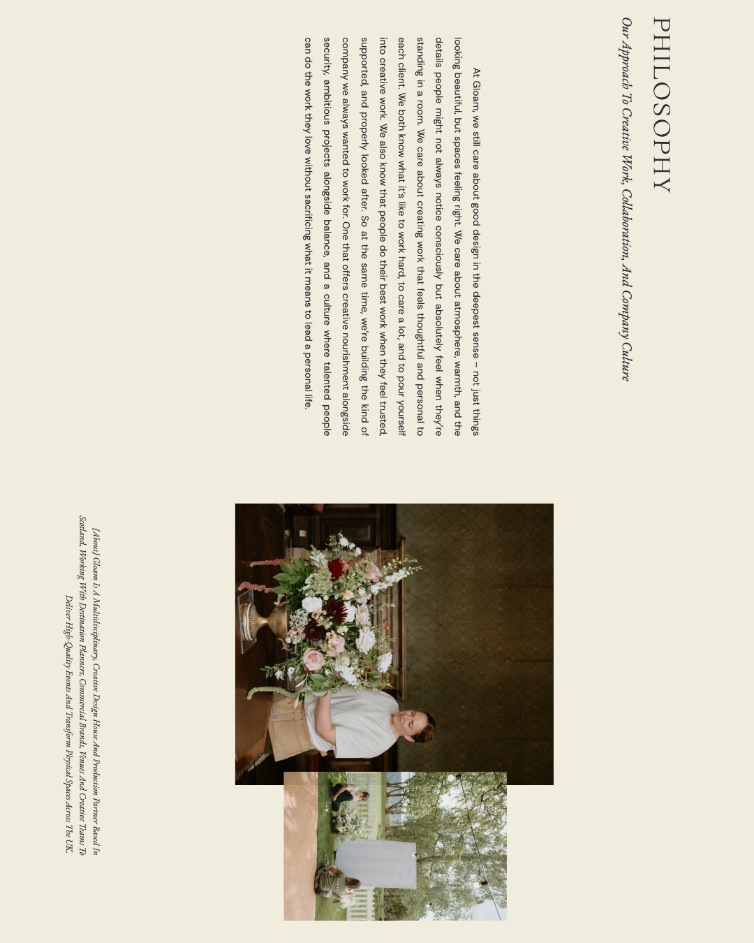
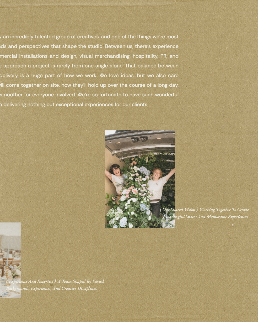
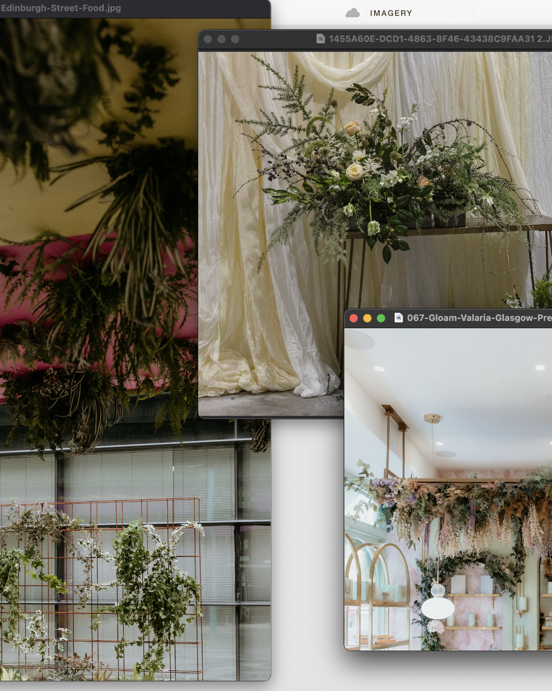
For the website itself, we wanted Gloam’s work to take up significant space, leaving lots of room for supporting messaging. Large imagery, architectural layouts, and contemporary typography create a sense of scale, while softer details and moments of warmth keep the experience feeling inviting (like textured backgrounds, subtle lines, and soft movement). Photography was intentionally selected to show more than couples and celebrations, making room for spaces, installations, tablescapes, details, teams, and the many layers of their work.
Every part of the experience was ultimately designed to support the same shift: from what do you need us to do, to what are we able to create together?
The finished brand world now gives Gloam a place to fully express the breadth of their work, the depth of their experience, and the kind of partnerships they’ve been creating along the way.